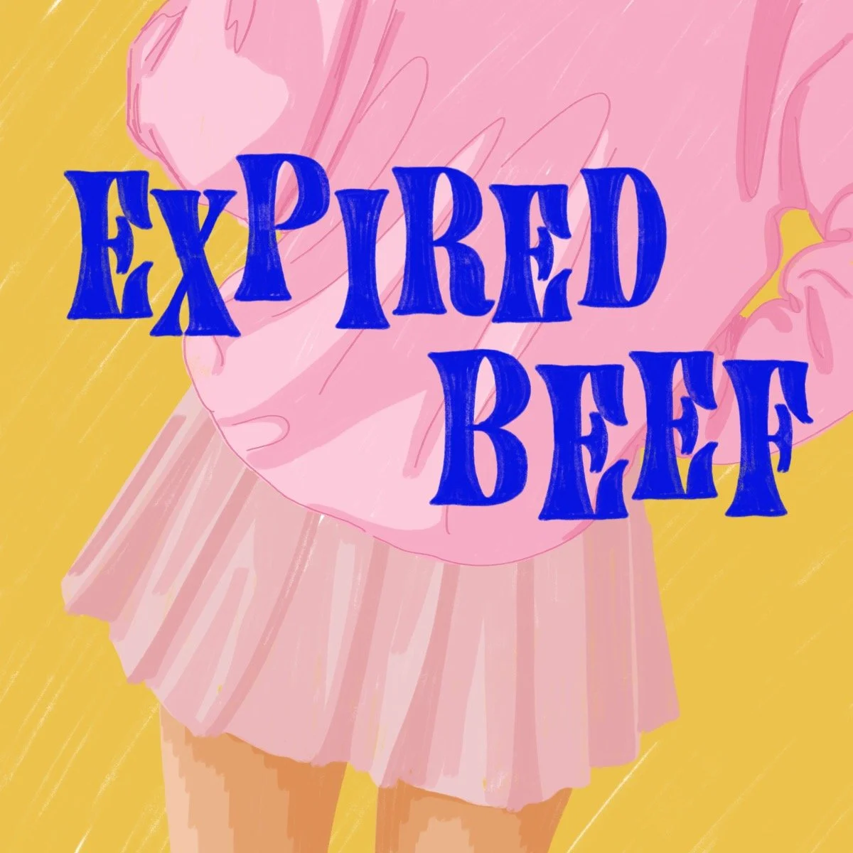
Client: The Razor/Gotham Writers
Project: Illustrations for Short Stories
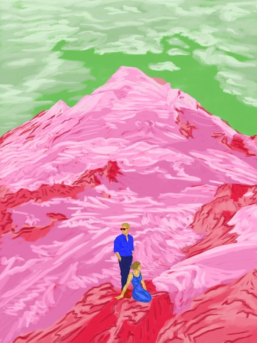
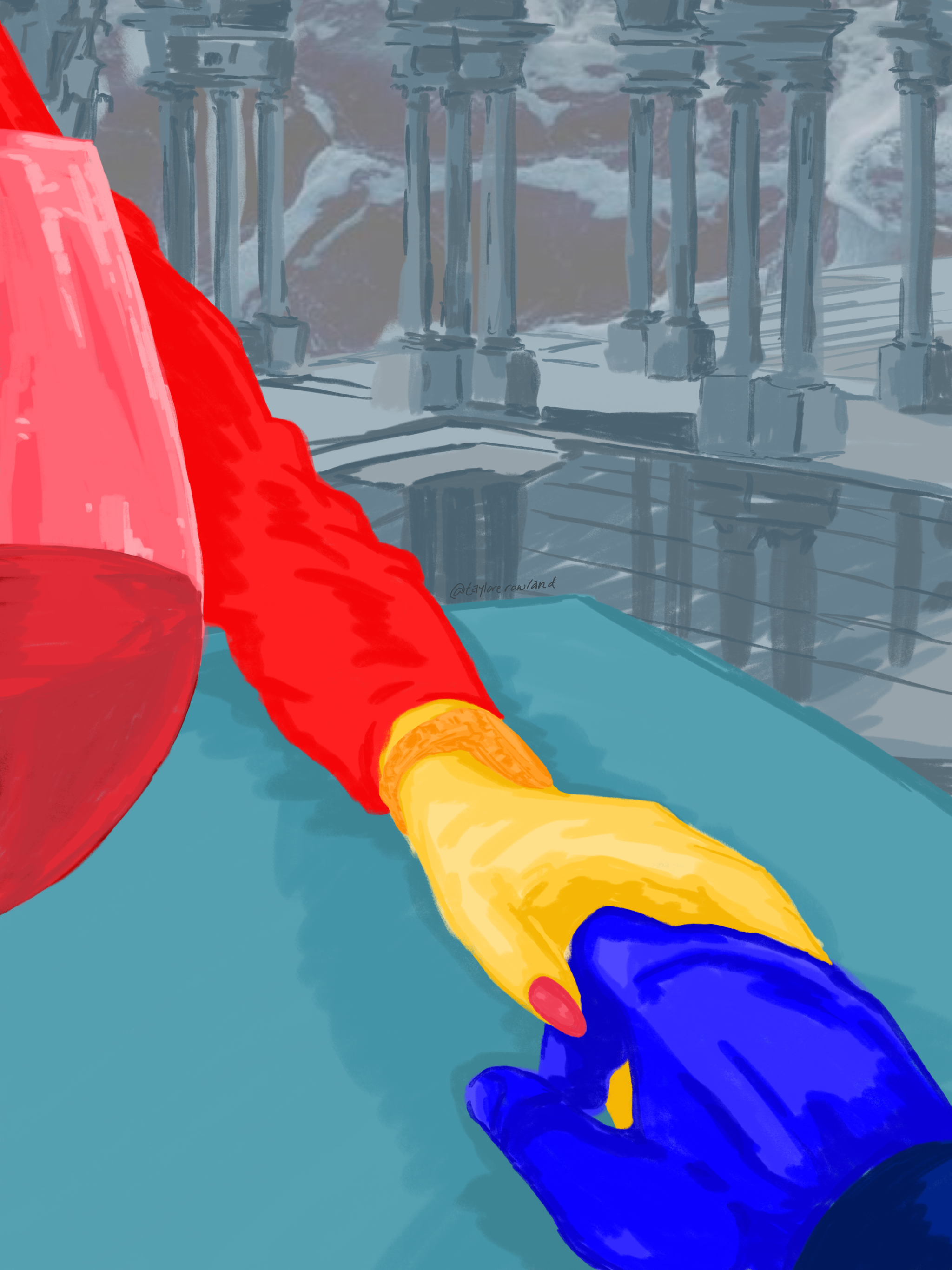
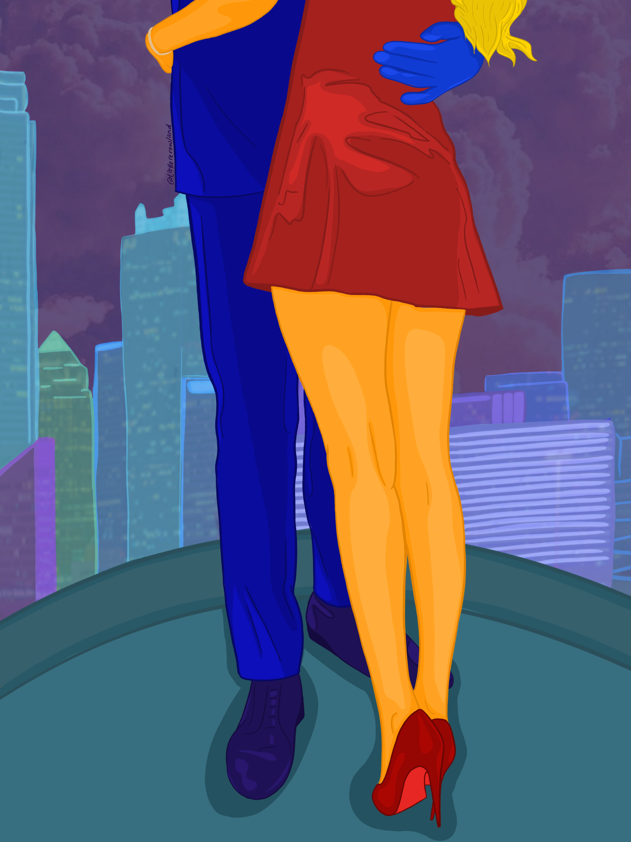
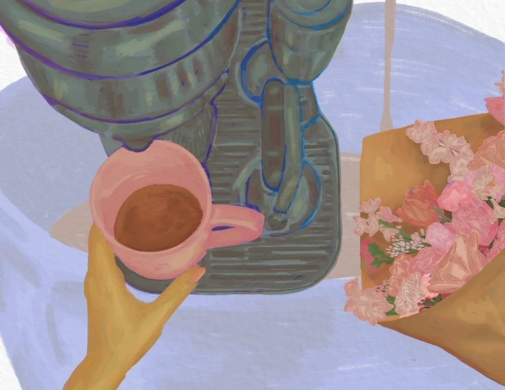
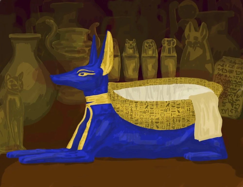
I created two illustrations for Gotham Writers / The Razor Magazine, each accompanying a short story and capturing the unique tone of the narratives. The first, for The Coffee Maker Who Stole Your Girl, blends humor and everyday absurdity through bold line work and playful color, emphasizing the story’s quirky, contemporary energy. The second, for King Tut’s Heart is Missing, draws on historical and fantastical elements, combining illustrative detail with a sense of whimsy to reflect the story’s imaginative world. Both pieces showcase my ability to adapt my style to different narratives while maintaining a cohesive, engaging visual voice.
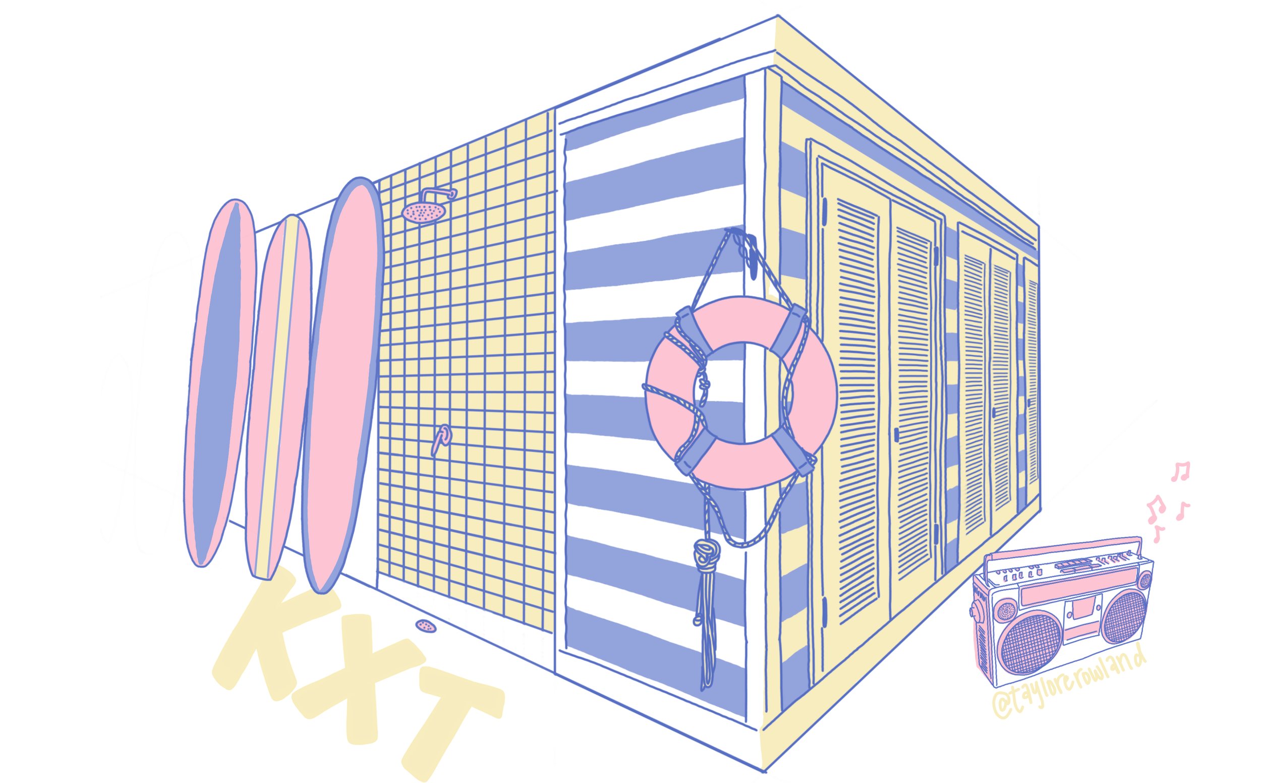
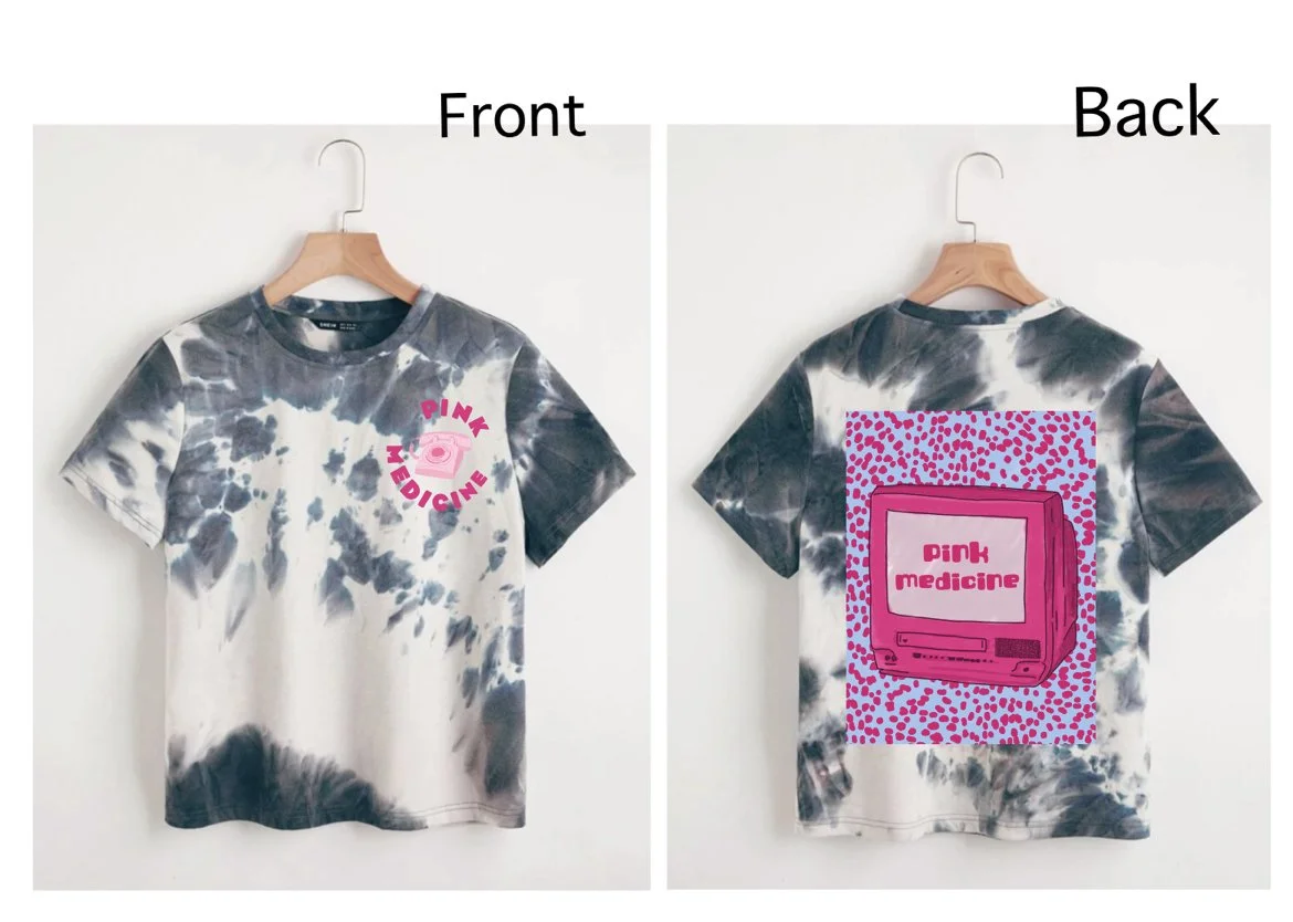
Client: KXT 91.7FM (KERA/NPR)
Project: Summer Fundraising Merchandise
Theme: Music Lover’s Paradise
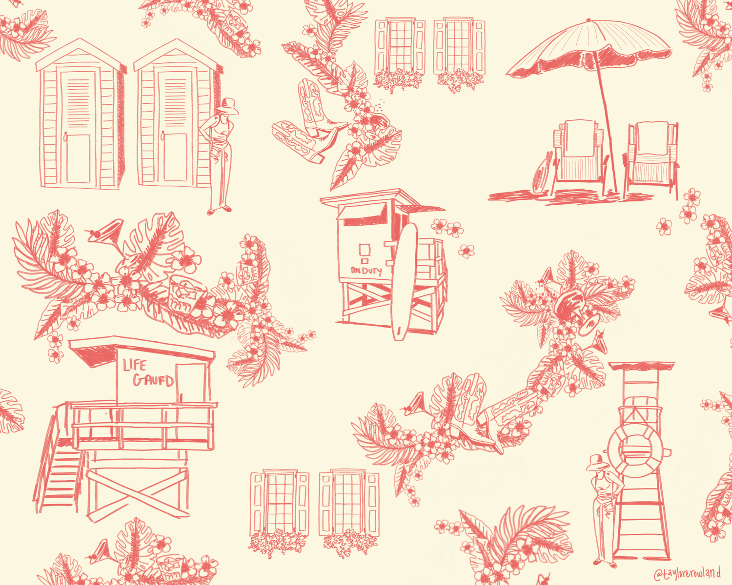
For KXT 91.7FM’s summer fundraising campaign, I designed a merchandise collection inspired by the idea of a Music Lover’s Paradise. The goal was to create something playful and eye-catching while still rooted in the station’s eclectic and creative spirit.
The final design took on a toile-inspired style, giving the illustrations a timeless, pattern-like quality with a modern twist. At the center, I combined classic summer imagery — an umbrella and sun chairs — with a whimsical conch shell base, symbolizing “hearing the music of the ocean.” To bring in KXT’s musical identity, I paired the scene with a retro boombox nestled beside the chairs, merging the laid-back atmosphere of a beach day with the joy of discovering new sounds.
This balance of detailed illustration and symbolic storytelling made the merchandise not only memorable but also a strong reflection of the community KXT has built: a place where music feels both personal and expansive, like your own private paradise.


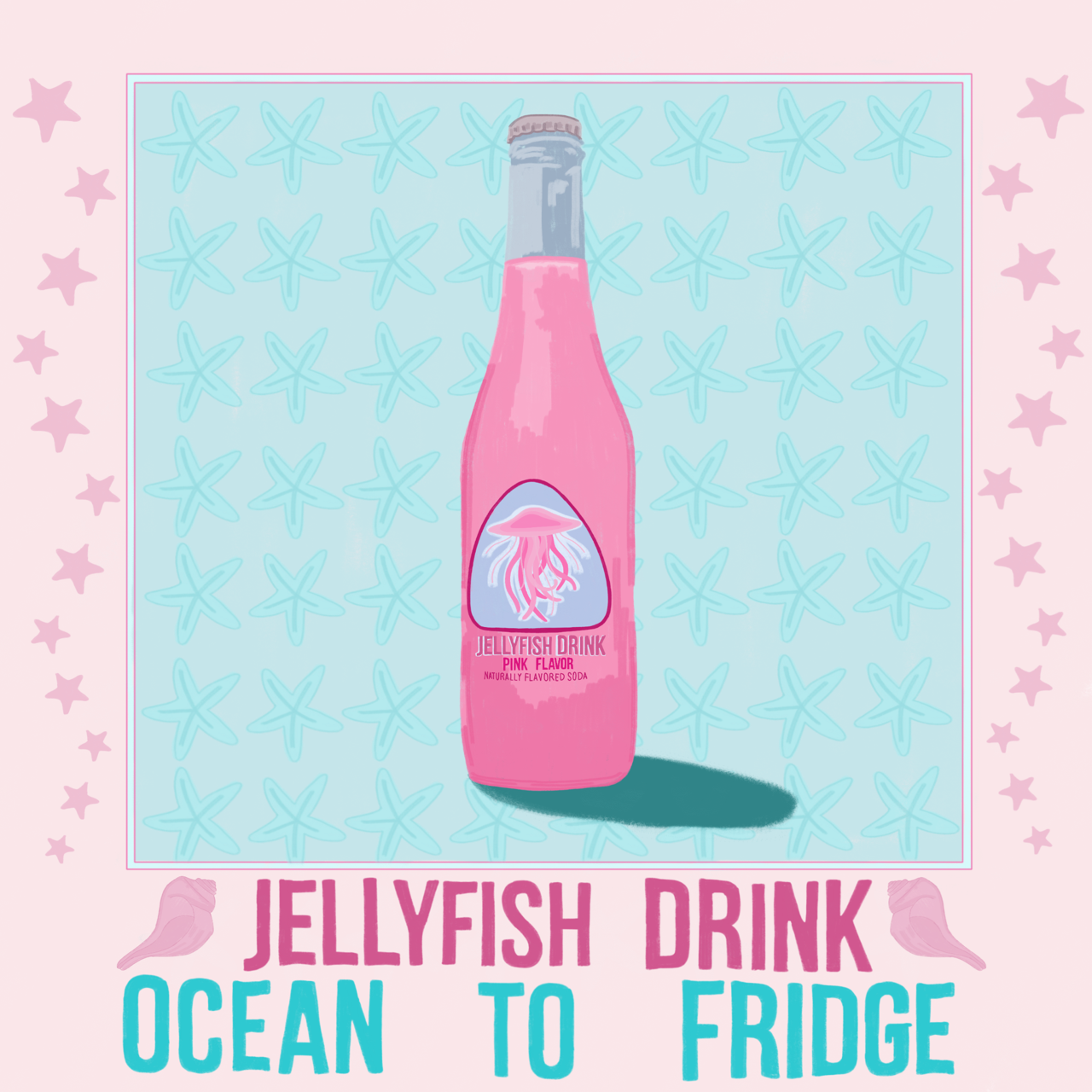


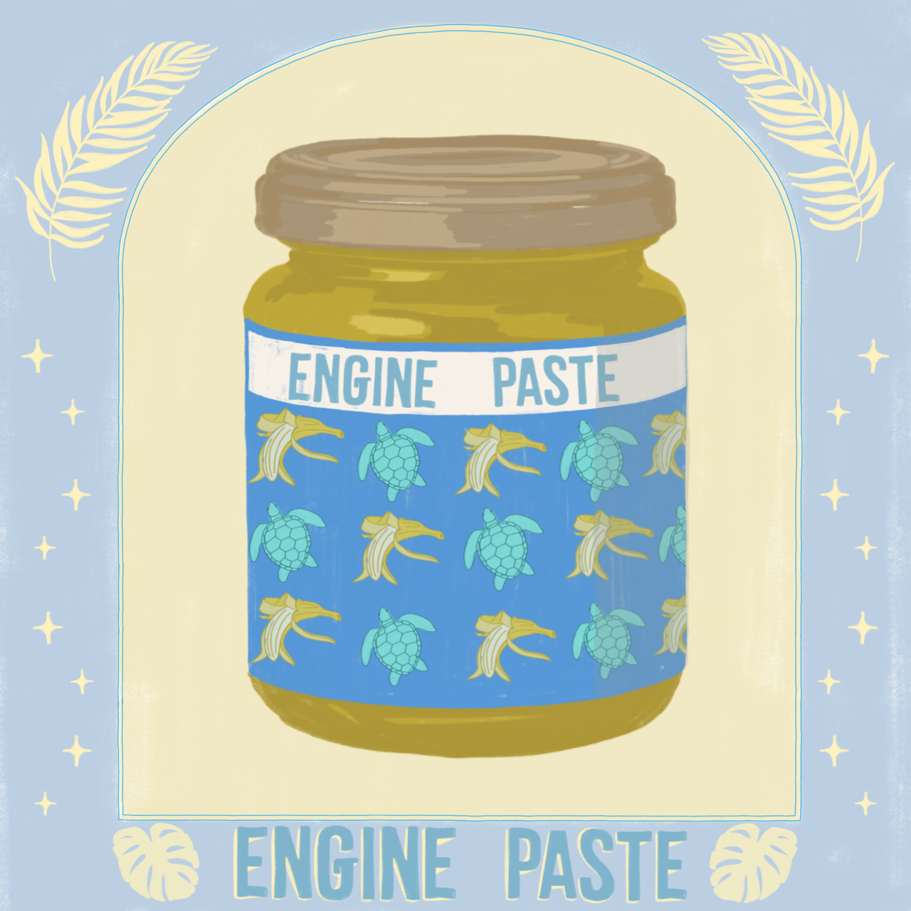


Exhibition: Packard Group National Exhibition 2023
Gallery: No. 7 Center Gallery / Packard Group LLC (Vermillion, SD)
Curator / Juror: Klaire Lockheart
As part of the Packard Group’s 2023 juried exhibition, I contributed two large-scale works — “Engine Paste” and “Jellyfish Drink” — which were wheat-pasted directly onto the exterior walls of No. 7 Center Gallery facing city hall by curator and juror Klaire Lockheart.
The wheatpaste installation format allowed the pieces to interact viscerally with the gallery’s architecture, inviting an ephemeral dialogue between the work, the wall, and the viewer. “Engine Paste” merged mechanical and organic imagery to evoke tension between industrial force and fragile life, while “Jellyfish Drink” used fluid forms and vivid colors to explore notions of beauty, consumption, and toxicity.
By presenting these works via a street-art technique within a gallery context, the installation bridged public and institutional spaces — making the art feel immediate, raw, and intimately tied to its surface.


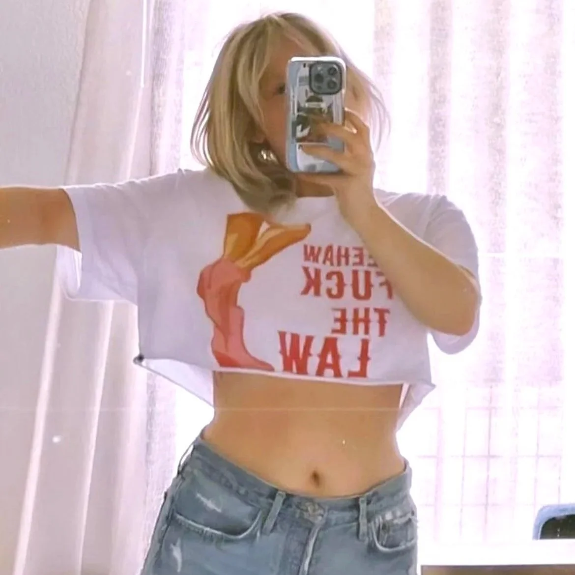
Client: GoEasy Shop
Project: Fundraising Merchandise
Theme: Texas Girly-Pop x Planned Parenthood
For GoEasy Shop, a women’s wellness and cannabis boutique, I designed a fundraising merch piece in response to the overturning of Roe v. Wade, with all proceeds going to Planned Parenthood. The goal was to create a design that felt distinctly Texan, unapologetically bold, and rooted in the shop’s feminine yet rebellious brand voice.
The final artwork featured a striking illustration of a woman’s bare legs in pink cowboy boots, paired with the rallying phrase “Yeehaw, Fuck the Law” in bold pink lettering. Set against a playful pink cow-print background, the design blended humor, defiance, and girly-pop aesthetics to create a piece that doubled as both fashion and protest.
This design resonated with GoEasy’s community by channeling Texas pride through a feminist lens, turning merch into a statement of solidarity and resistance — while raising funds to directly support reproductive healthcare access.

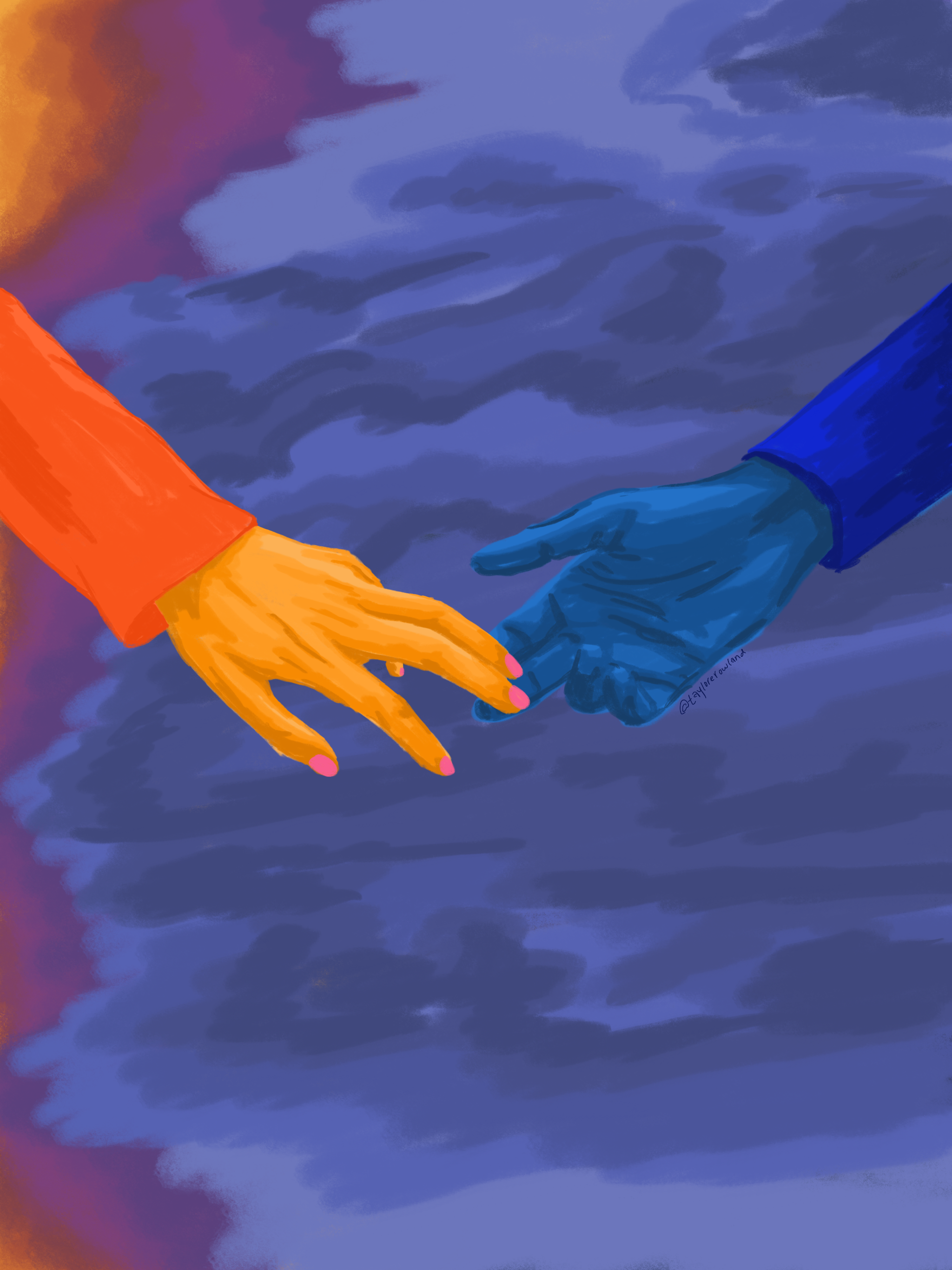
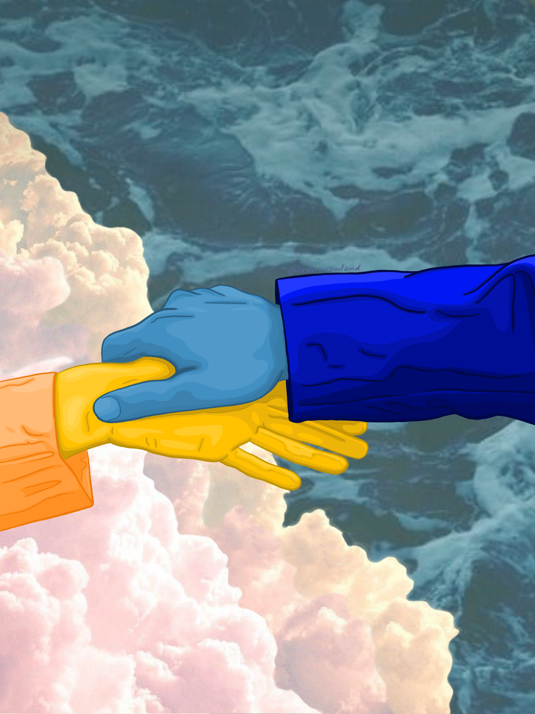
Client: Ally Bank x NASCAR
Project: Pride Event Merchandise
Theme: Racing into Pride
For Pride Month, I created merchandise for Ally Bank’s NASCAR Pride event, bringing together the speed and excitement of racing with the inclusivity and celebration of LGBTQ+ Pride. The challenge was to design something that felt authentic to NASCAR’s culture while boldly representing the diversity of the LGBTQ+ community.
The design featured a checkered rainbow flag as the central backdrop, symbolizing the fusion of racing tradition with Pride. In the foreground, the Ally Bank race car took center stage, surrounded by a pit crew in action. Each crew member’s jumpsuit displayed a different LGBTQ+ flag, highlighting the many identities within the community. Together, the pit crew acted as a visual metaphor for allyship — working as a team to keep the car moving forward, just as allies support and uplift the LGBTQ+ community.
The result was a vibrant, high-energy design that merged NASCAR’s competitive spirit with Pride’s message of unity, progress, and visibility.
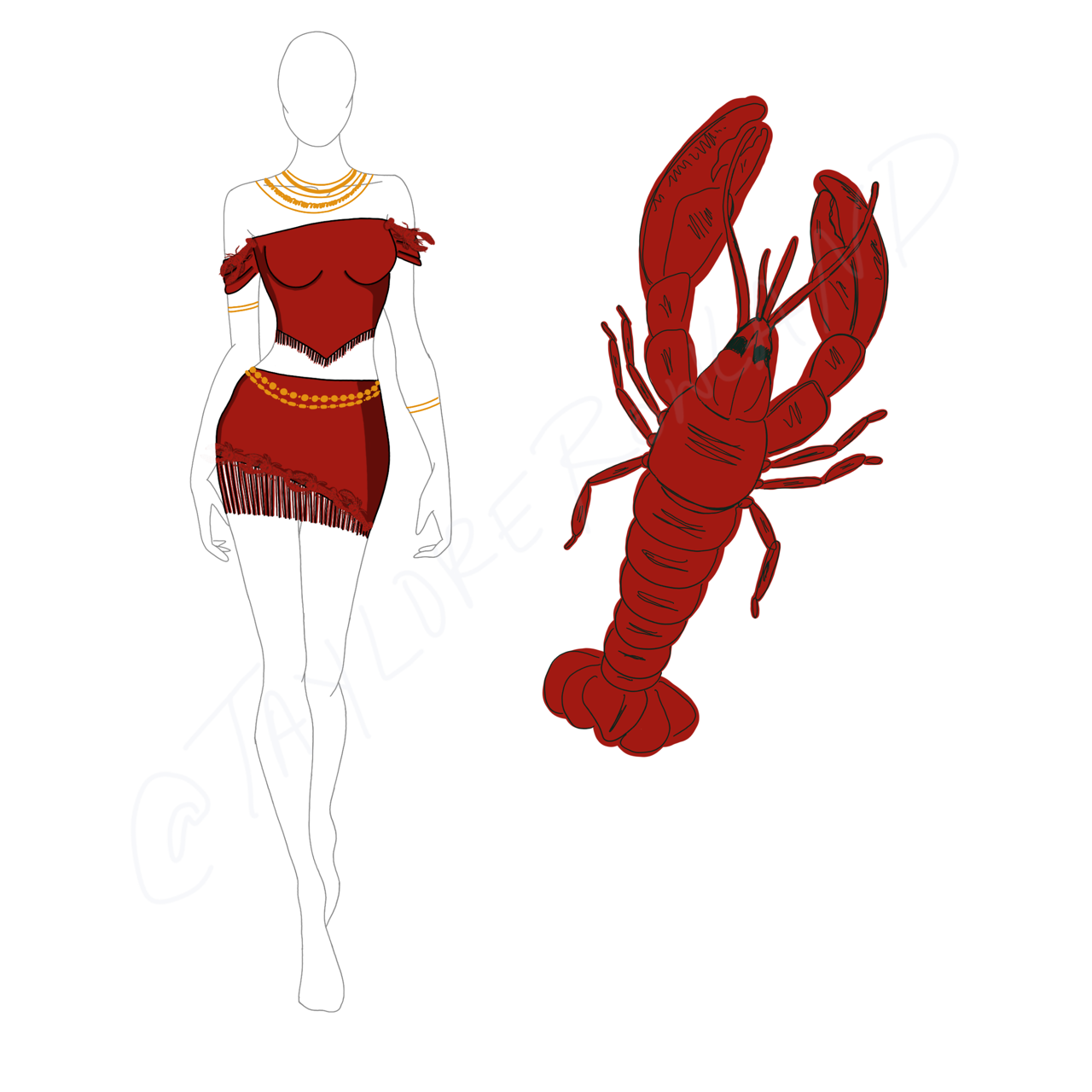
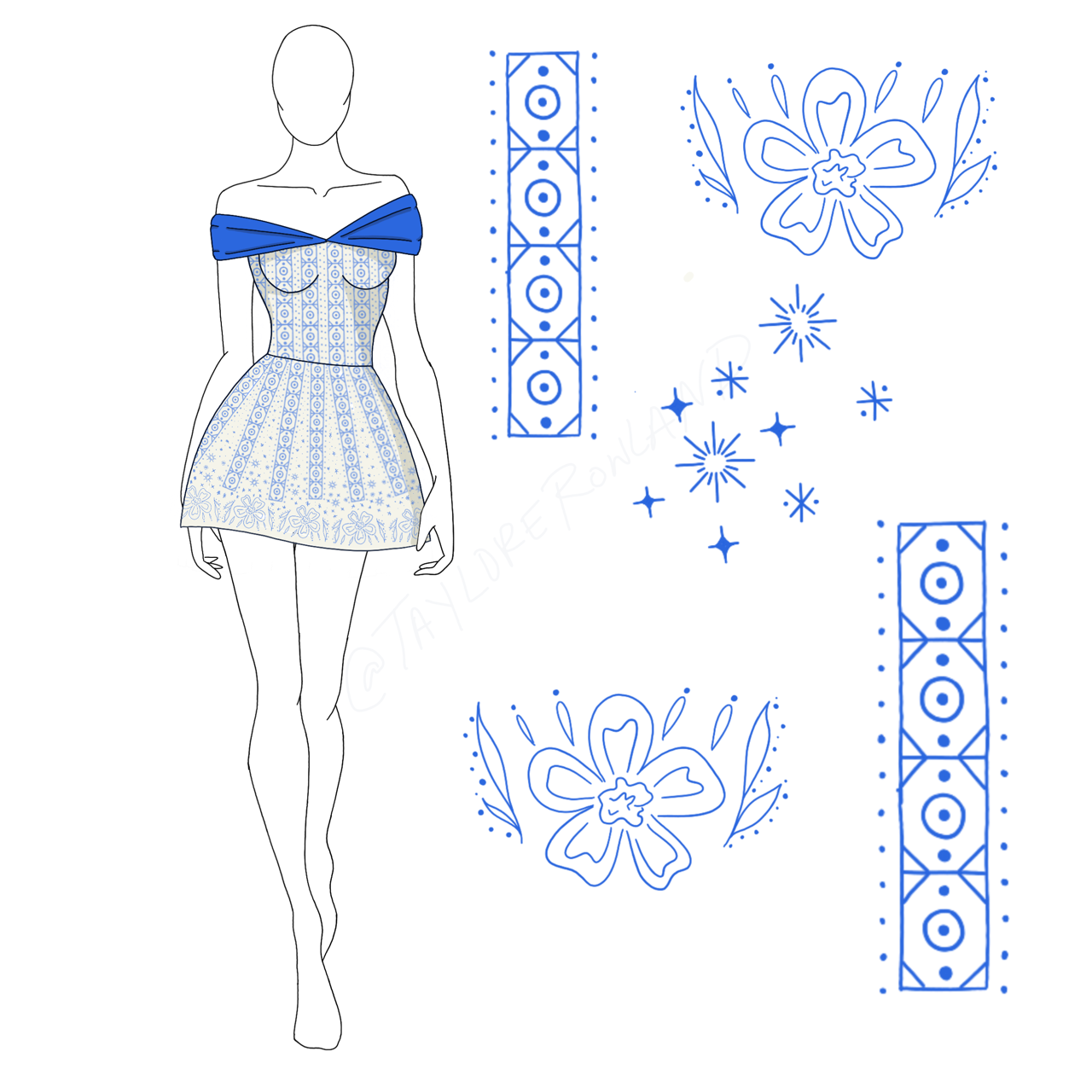
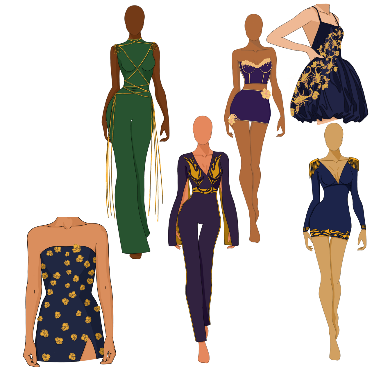
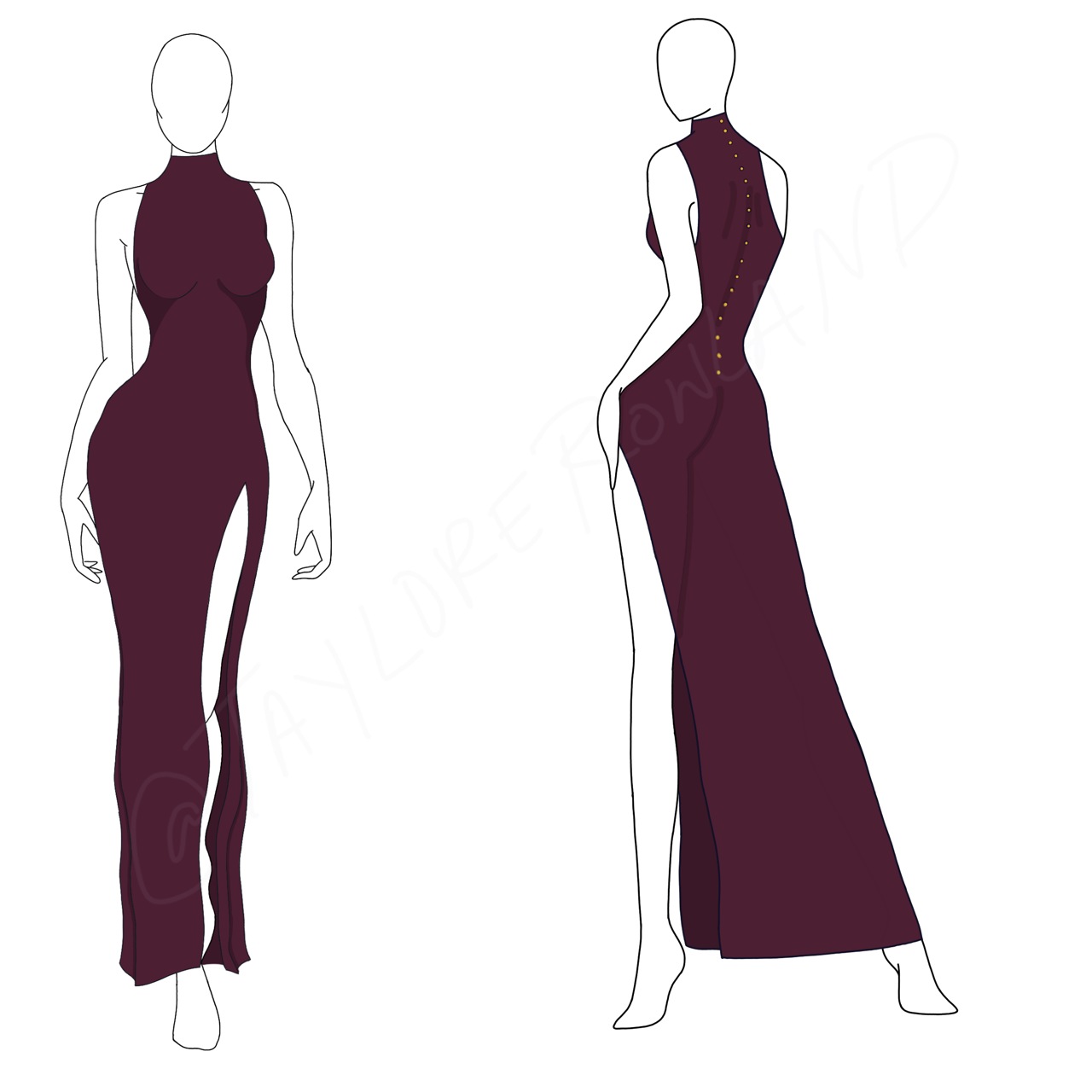
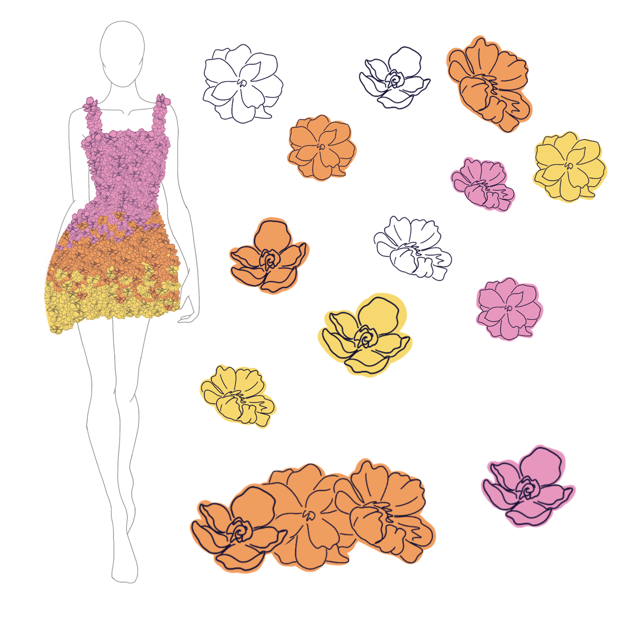
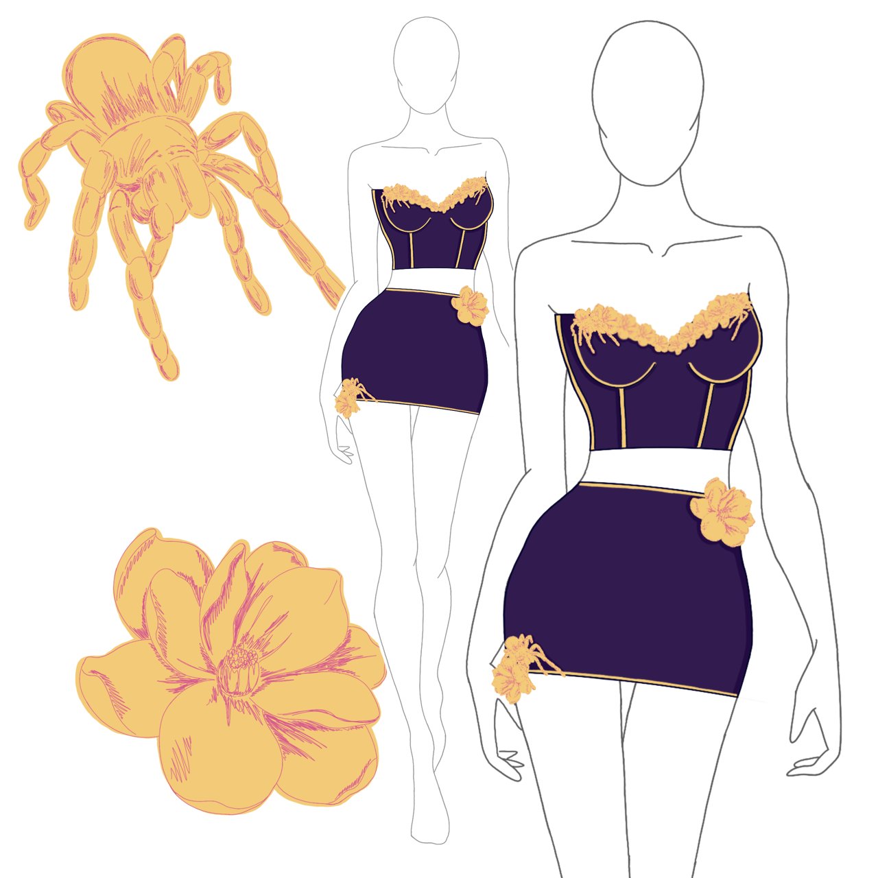
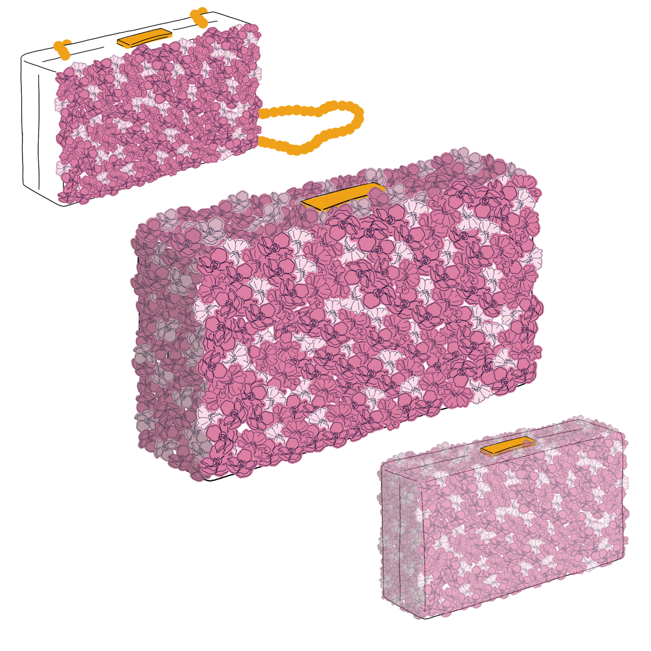
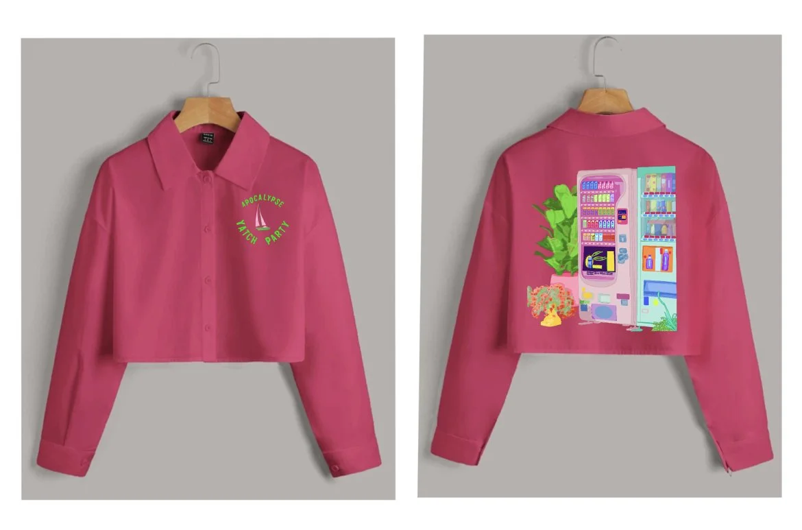
Client: SHEIN X
Project: 10-Piece Collection
Theme: Spring/Summer
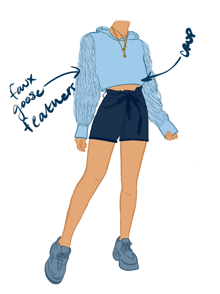
For the SHEIN X program, I designed a 10-piece Spring/Summer collection that pushed beyond typical seasonal trends, combining bold aesthetics with cultural commentary. The collection leaned into vibrant colors paired with the rougher side of old-money Americana, reinterpreted through a playful yet disruptive lens.
Key pieces incorporated intentional misspellings and apocalyptic motifs, creating a tension between tradition and collapse — a nod to both heritage style and the fractured state of modern culture. The result was a collection that felt familiar yet subversive: preppy silhouettes and Americana codes twisted into something raw, irreverent, and undeniably current.
This project emphasized my ability to balance trend-driven commercial design with conceptual storytelling, creating pieces that stood out in both wearability and narrative depth.


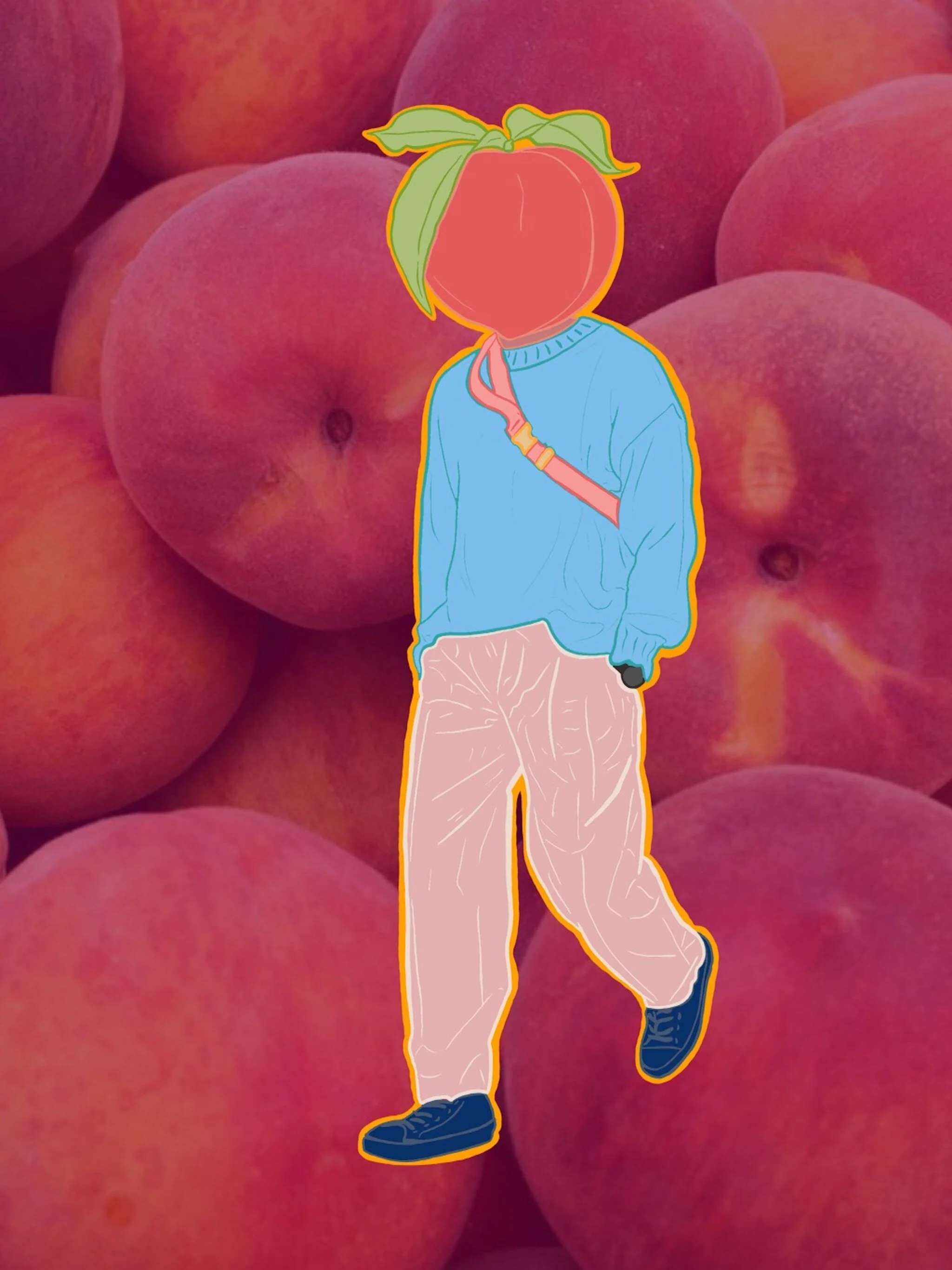
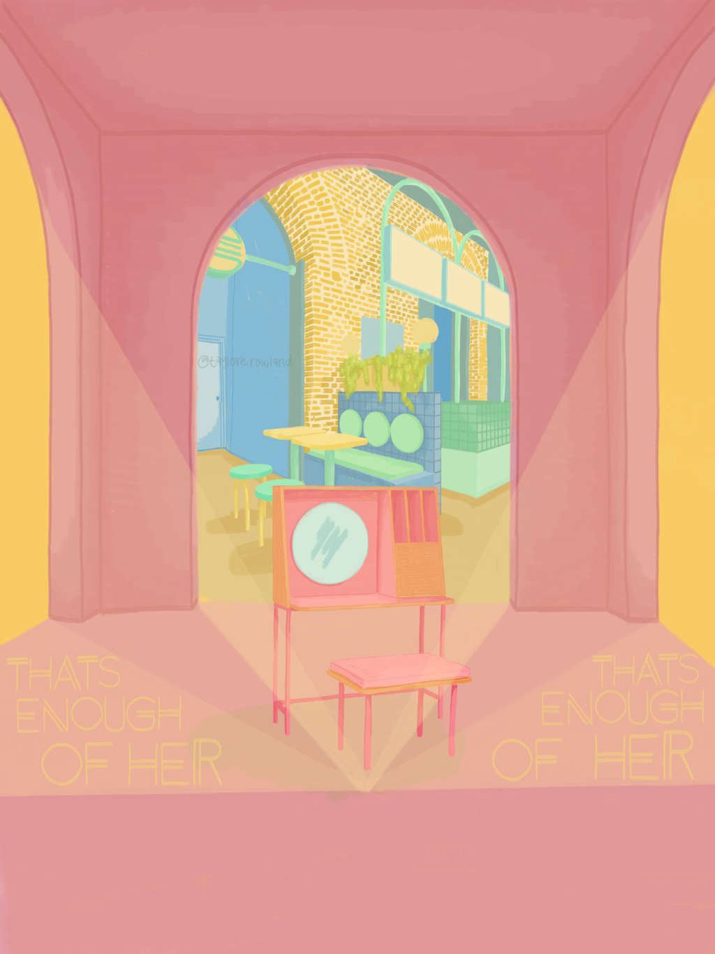
Client: Art & Type Magazine
Project: Zine Print Contribution
Theme: Where Do You Call Home
I was invited to create an original art piece for Art & Type Magazine’s zine centered on the theme “Where Do You Call Home.” My work explored the layered, often fluid nature of belonging — using visual storytelling to capture how “home” can be both a physical place and an emotional state.
Through a mix of bold typography and illustrative elements, the piece reflected on the tension between nostalgia and movement, permanence and change. The result was an artwork that resonated with the zine’s ethos: home as a concept that’s deeply personal, multifaceted, and ever-evolving.

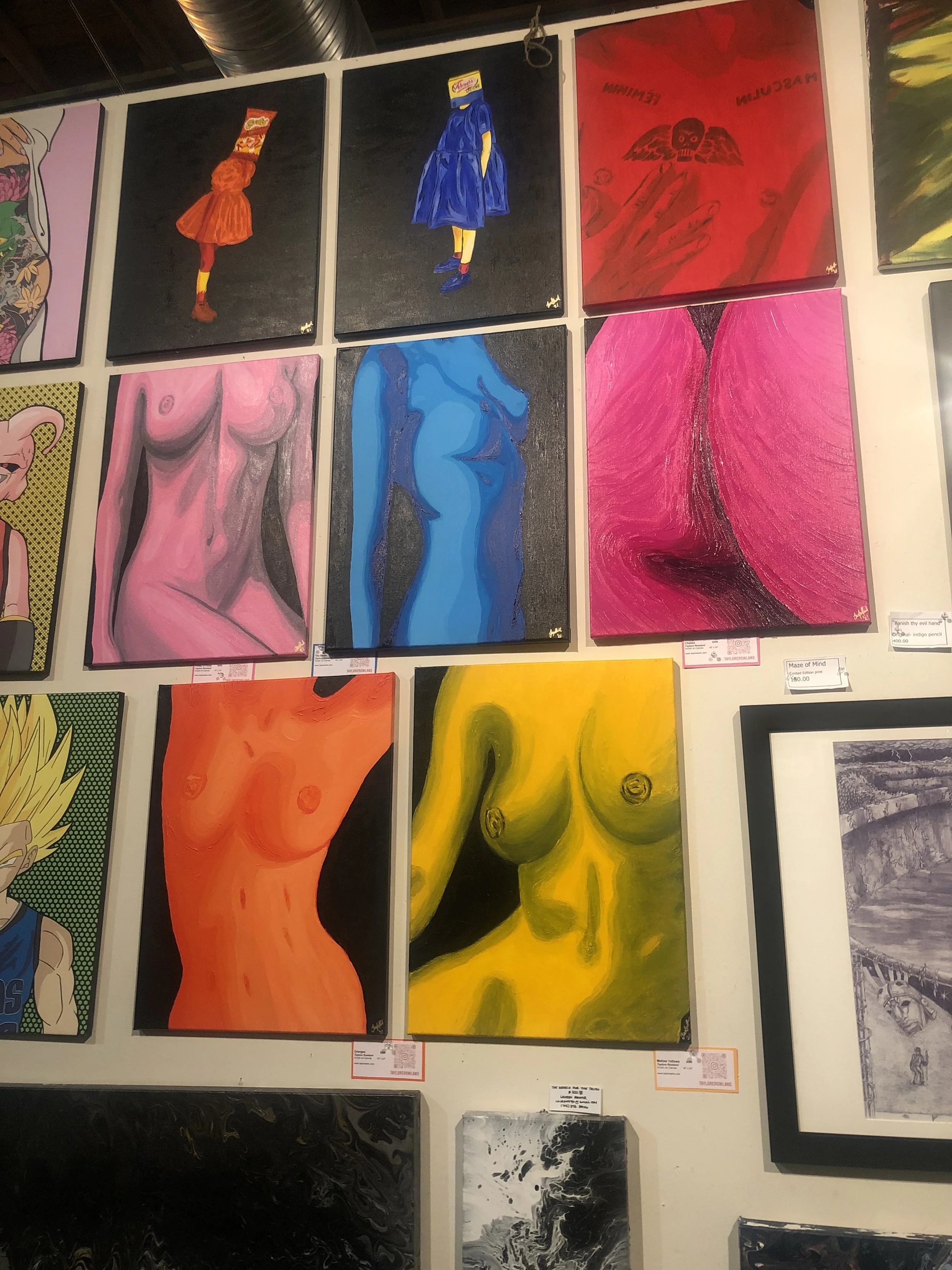
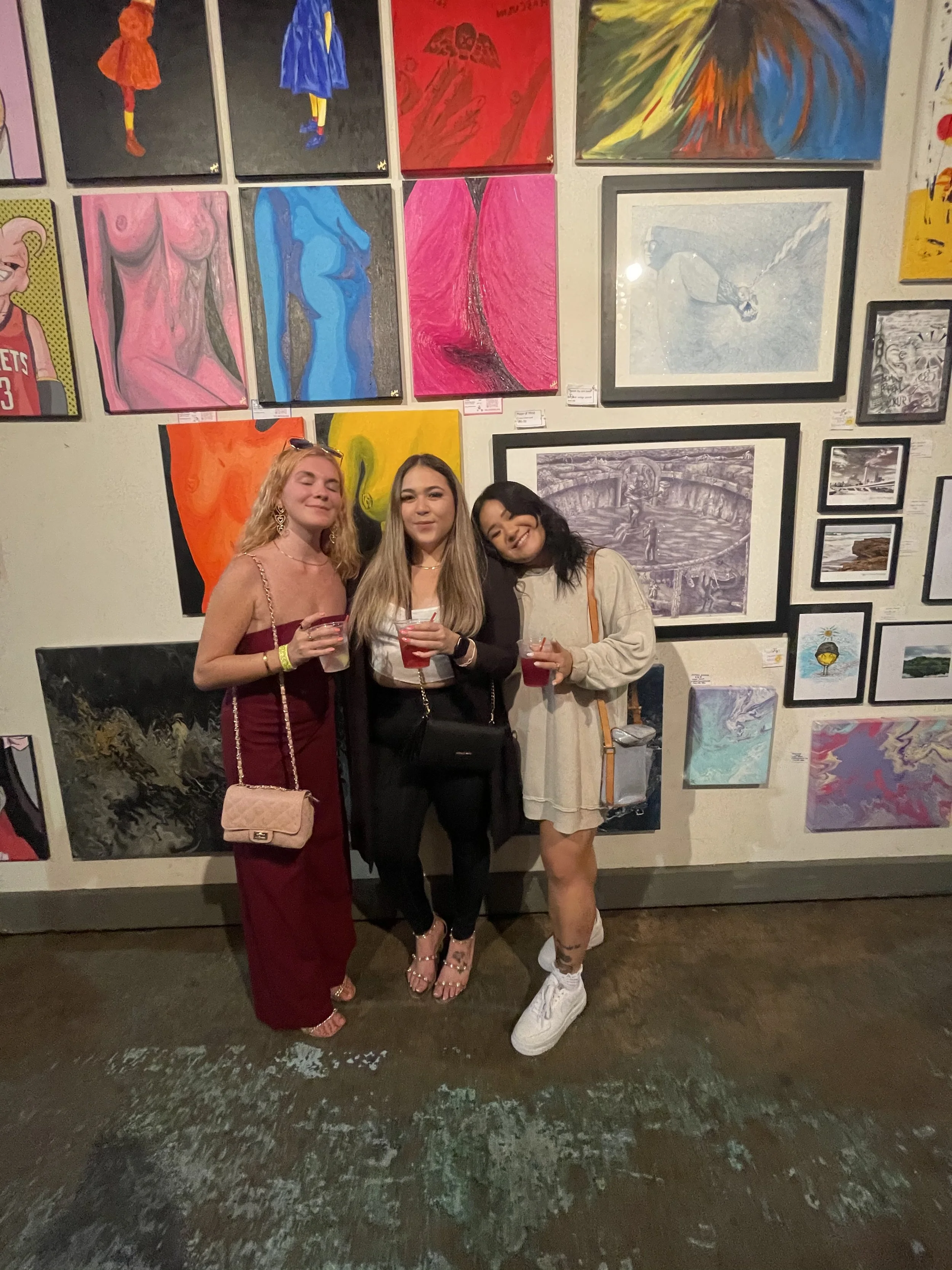
Client / Event: The Chocolate and Art Show
Location: Lofty Spaces, Dallas, TX
Project: Group Exhibition
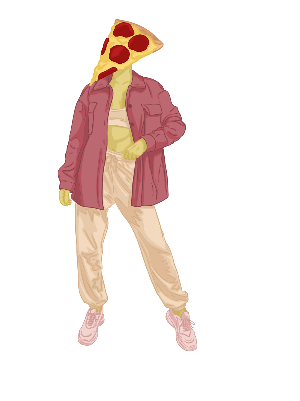
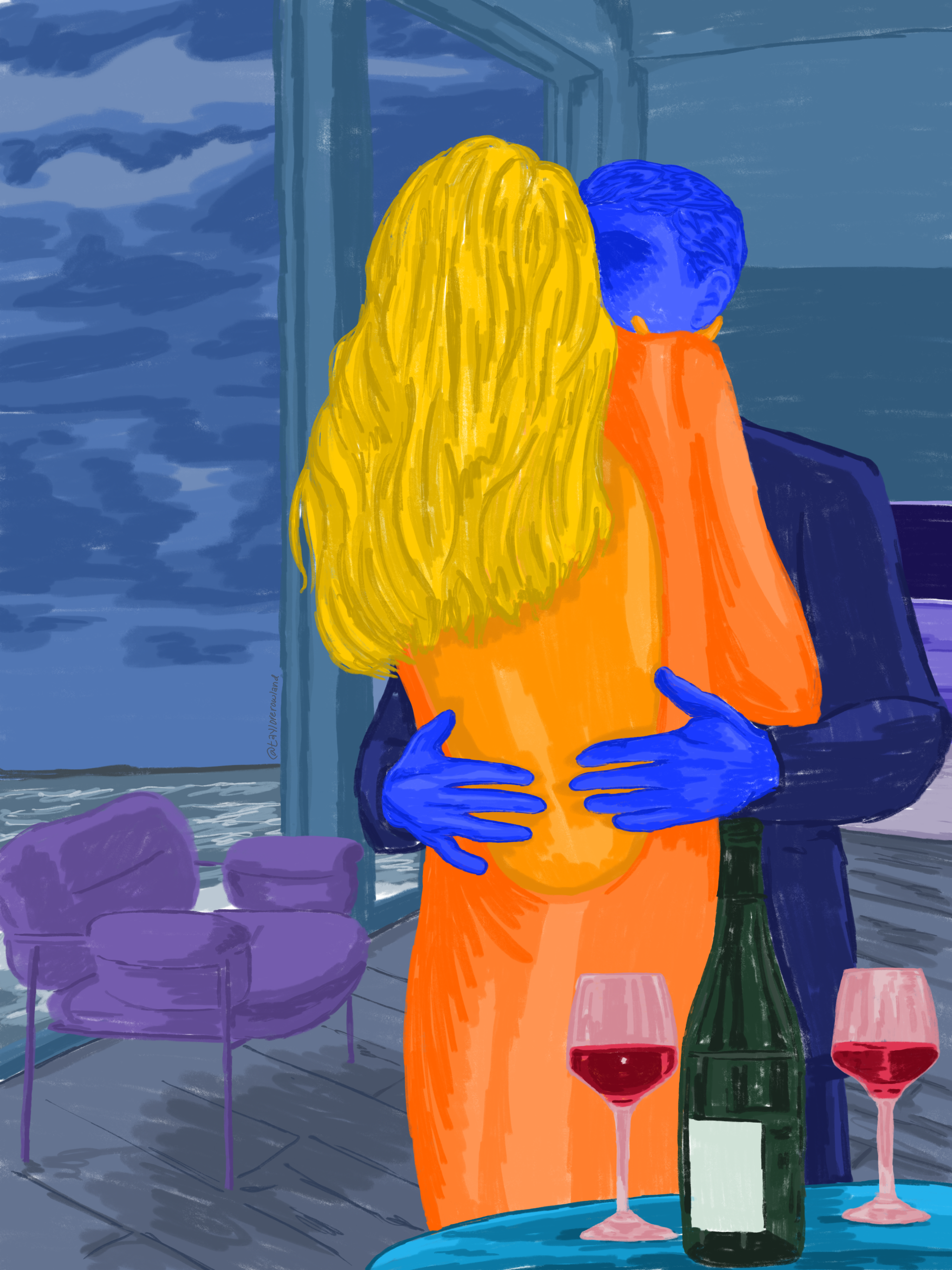
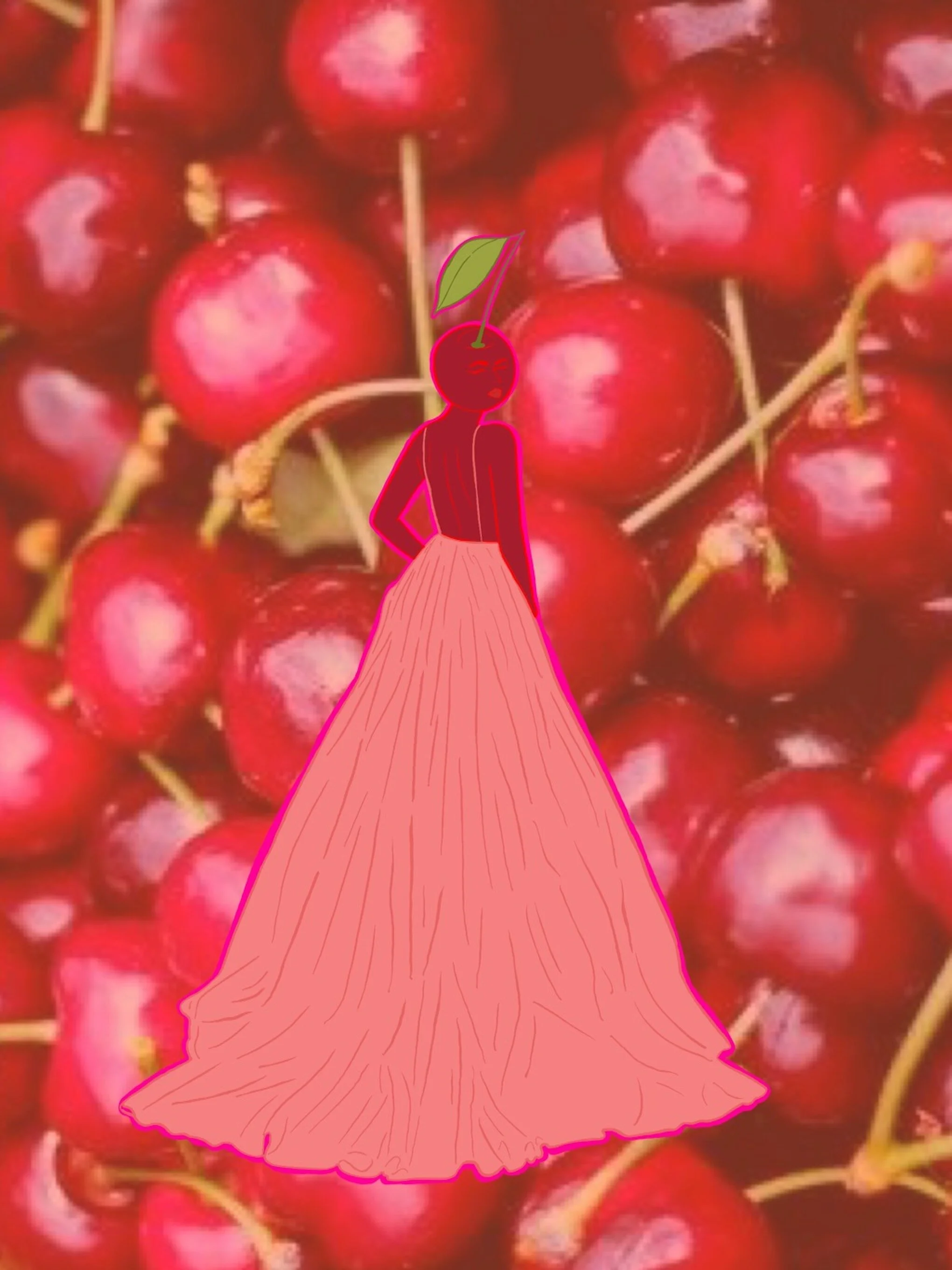
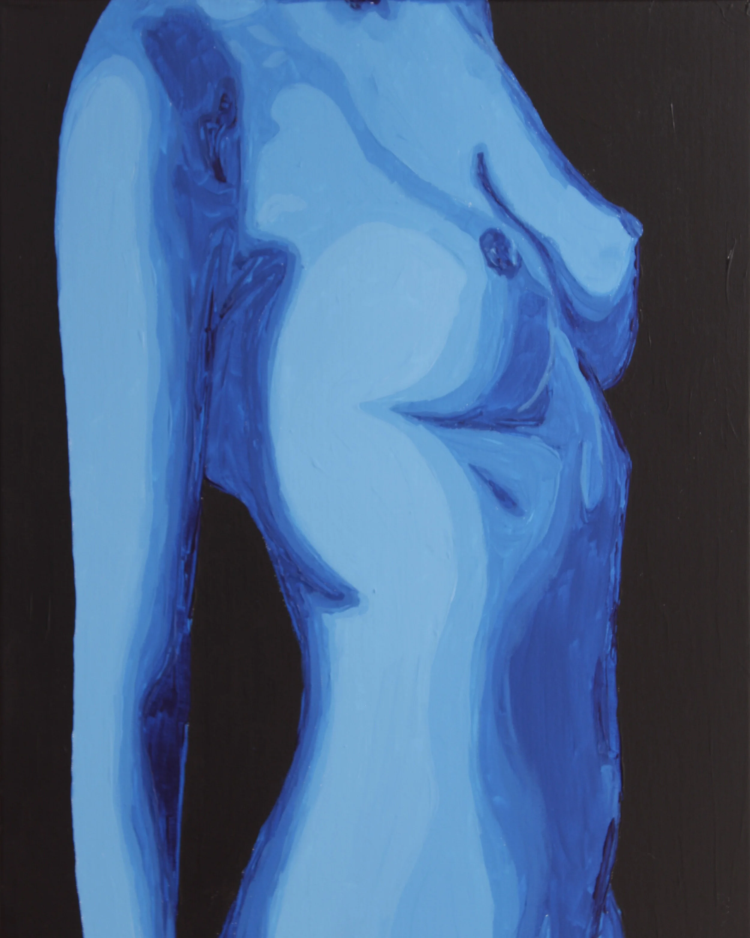
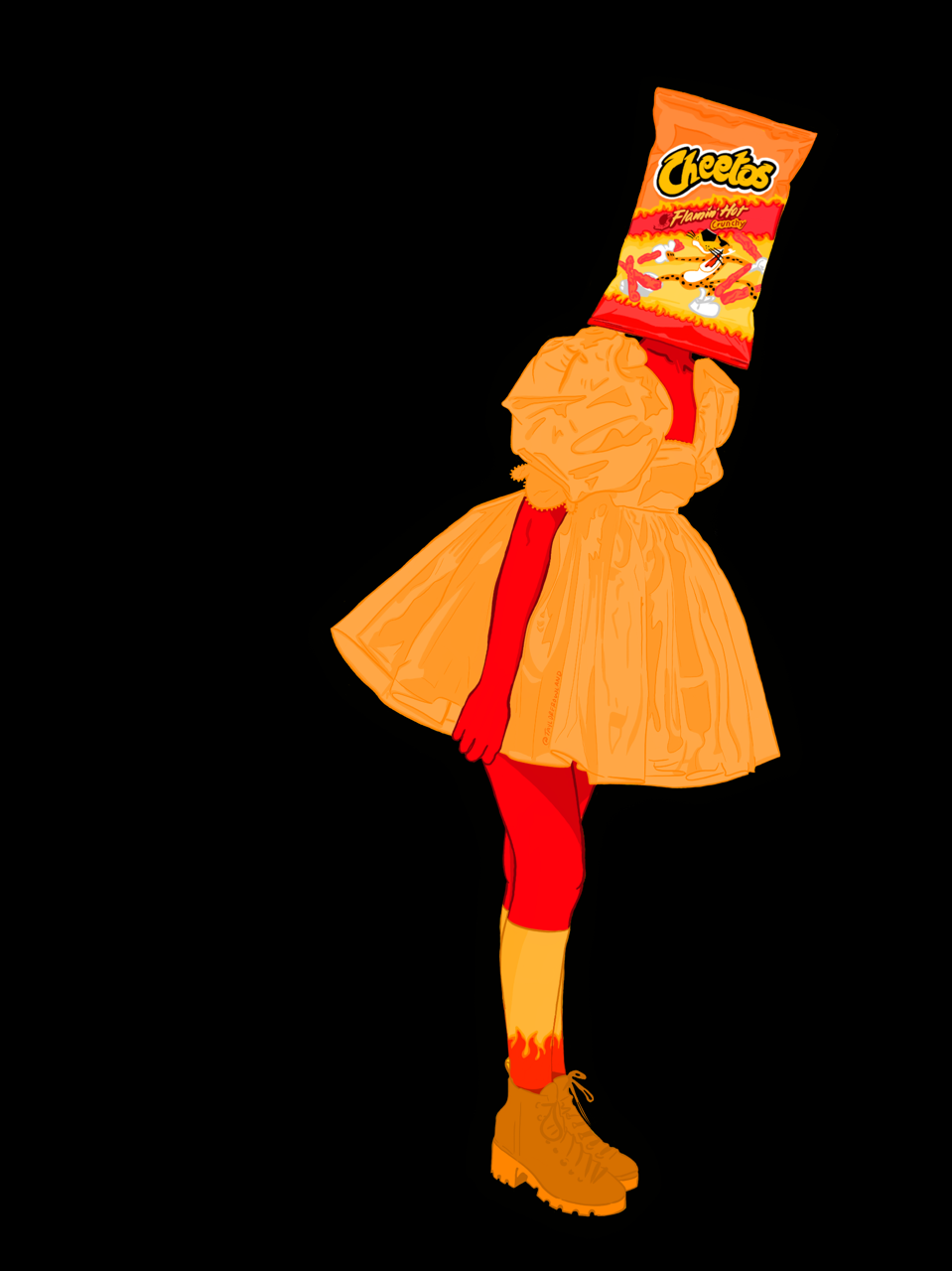
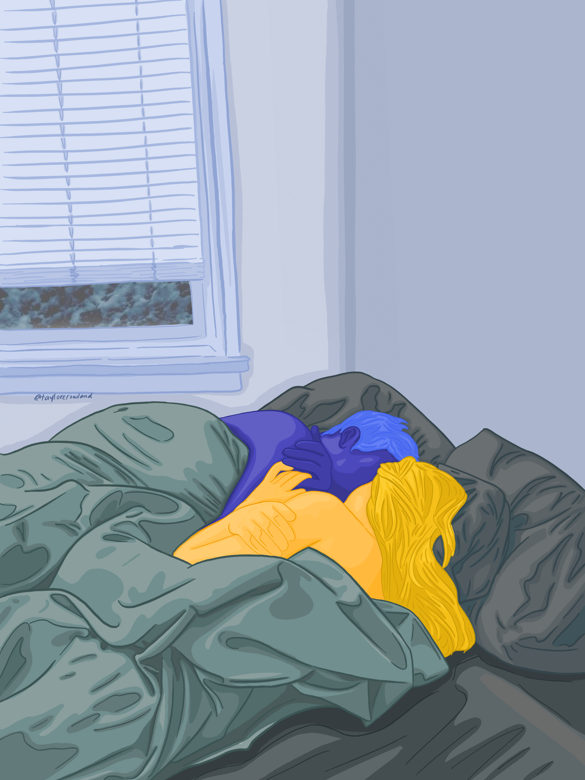
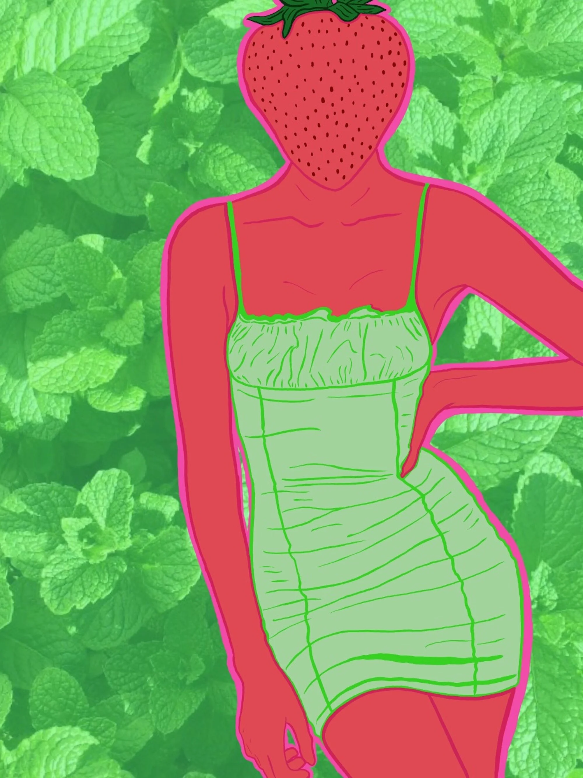
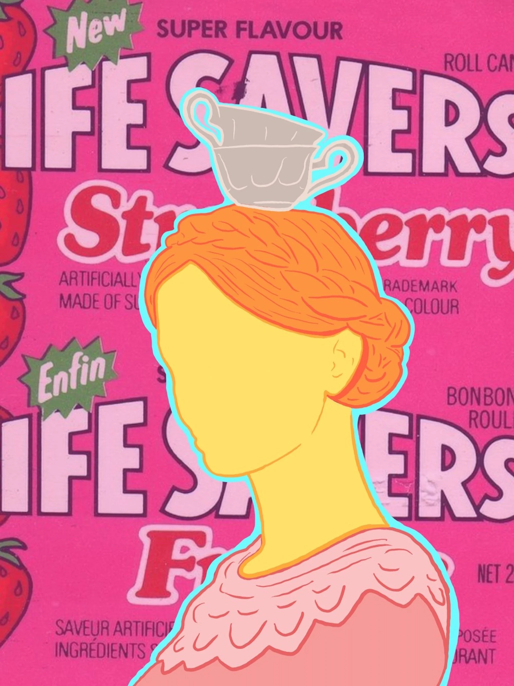
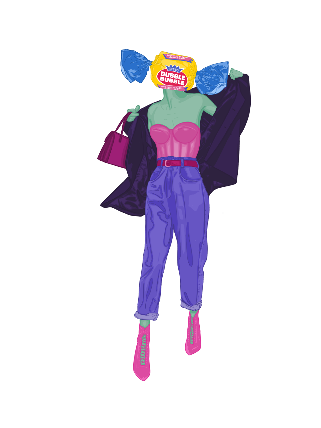
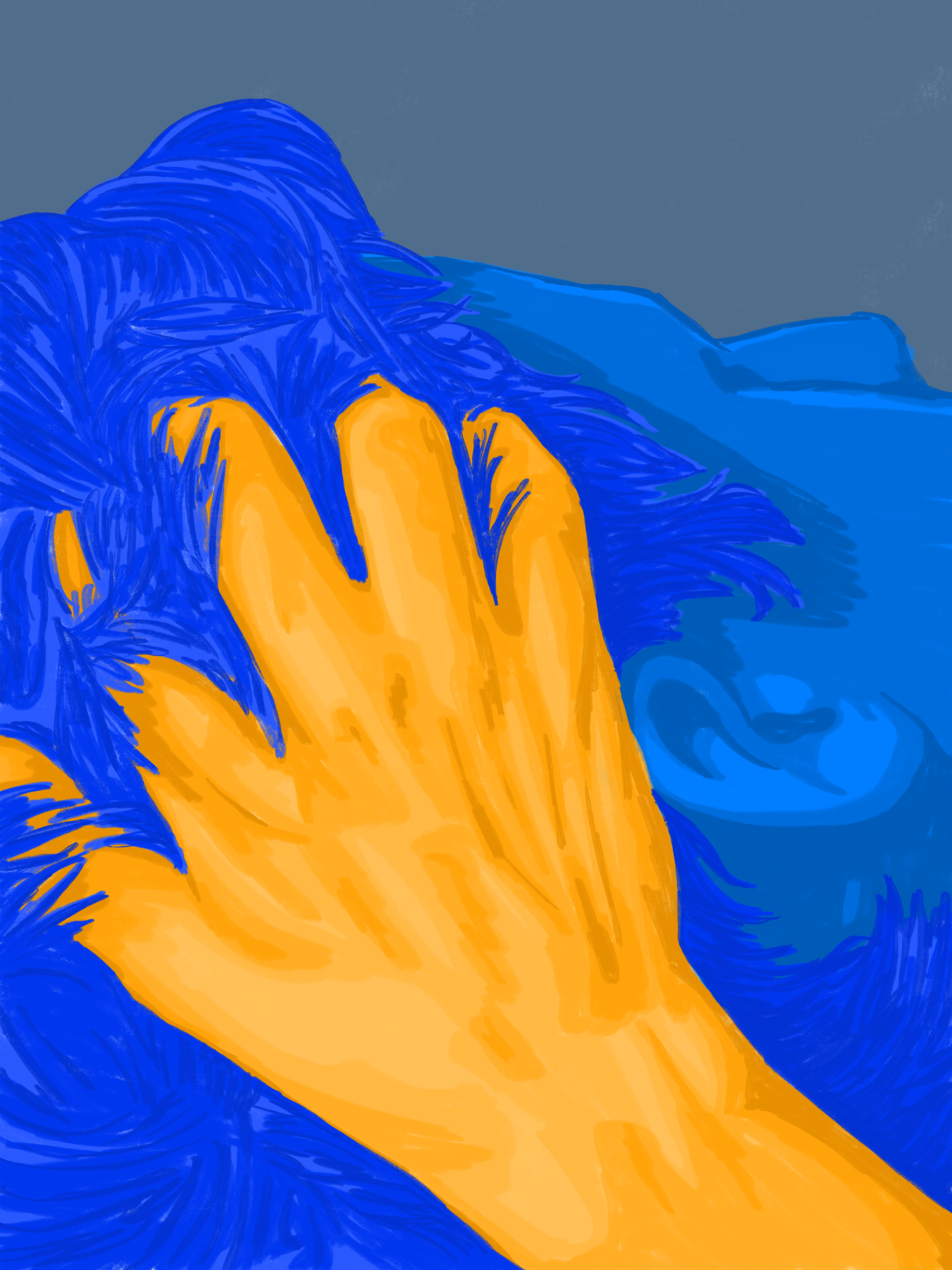
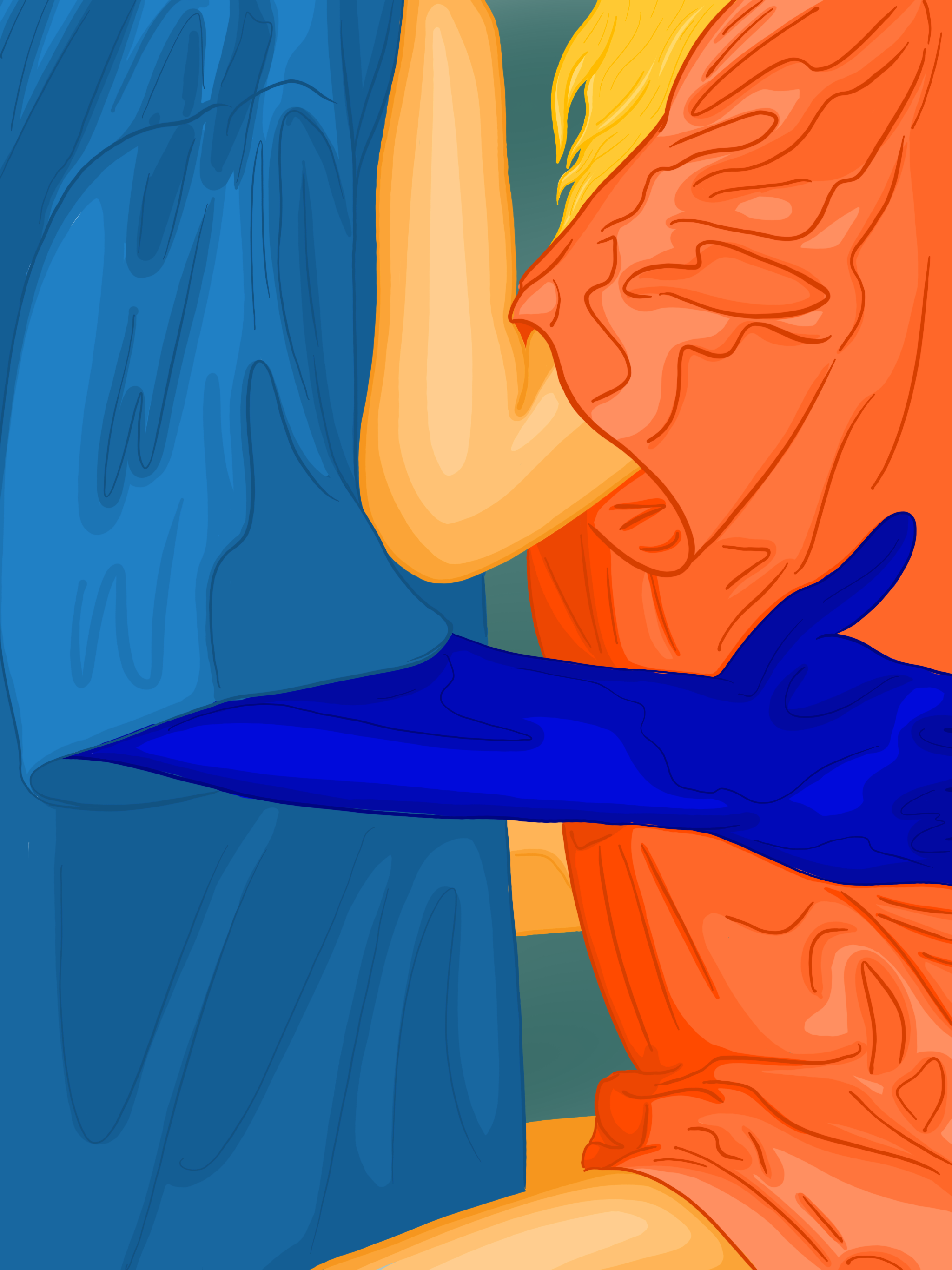
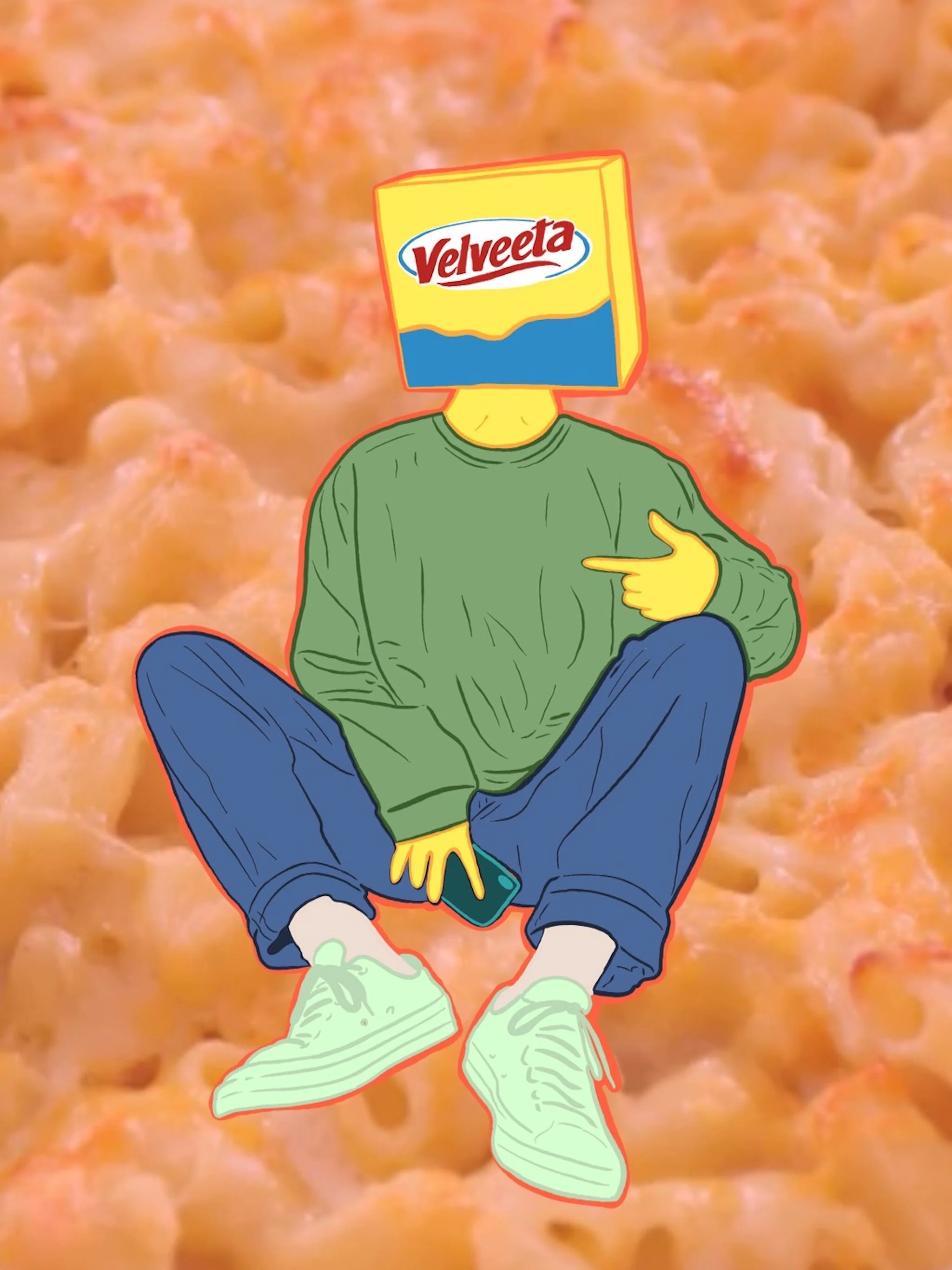
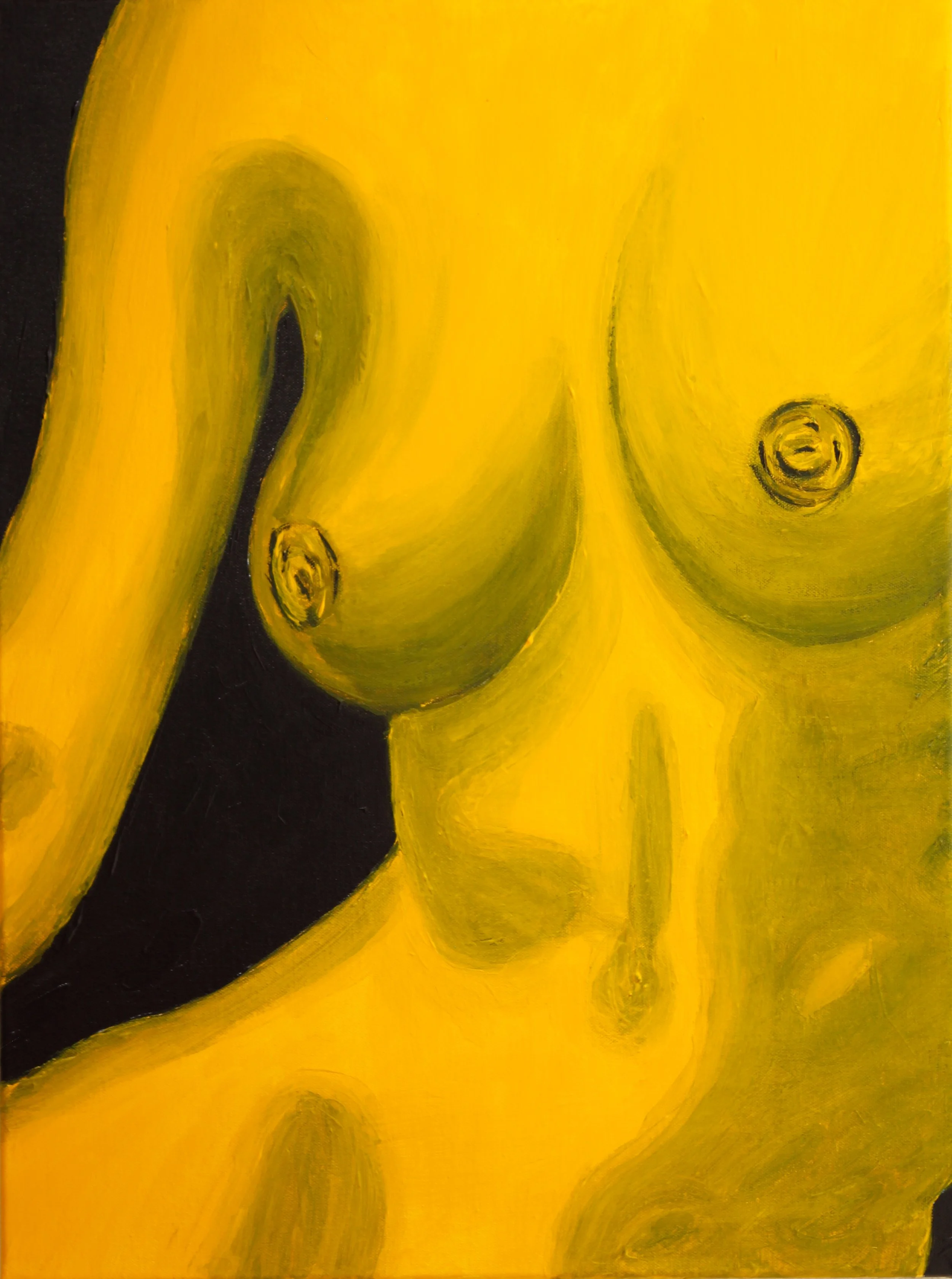
I exhibited multiple bodies of work at The Chocolate and Art Show in Dallas, showcasing pieces from two ongoing series that explore femininity, humor, and pop culture through a vibrant, stylized lens.
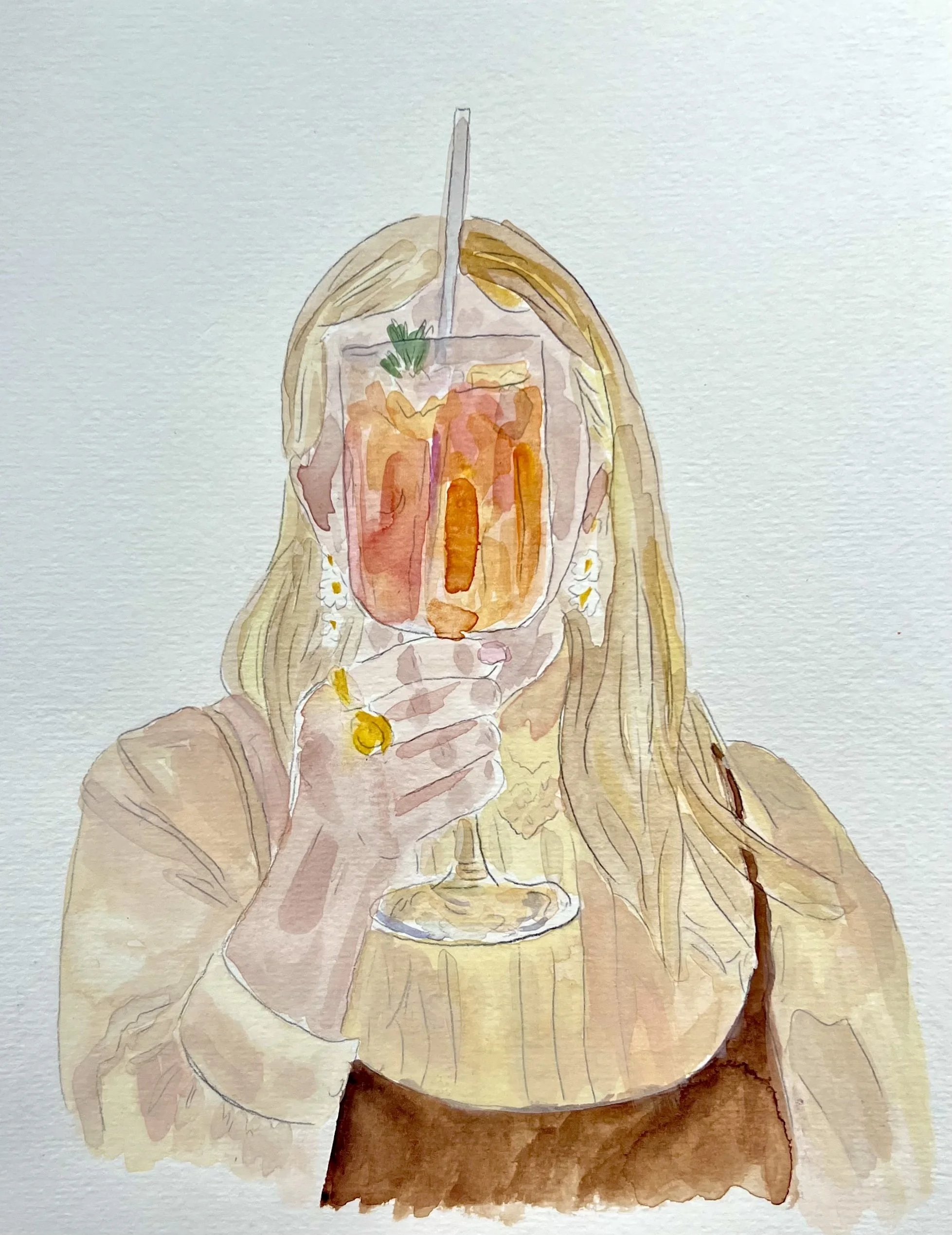
The first body of work featured my colorful yet monochromatic nude series, focusing on form, tone, and emotion through saturated palettes that celebrate the human body with both boldness and restraint. The second, from my Snack Babes collection, took a more playful, fashion-inspired approach — featuring stylized female figures whose “heads” were transformed into iconic snacks like Hot Cheetos and other junk-food staples.
Together, the pieces explored consumption, identity, and desire — blending sensuality with satire. The juxtaposition of high-fashion poses and snack imagery created a commentary on beauty culture, indulgence, and the ways we brand ourselves.


2025


2024 & Before